All we hear about in the news or Facebook feeds today is how houses are selling like crazy! There isn't enough supply for the demand. Whether you are buying your dream home, or making your existing home the dream, here's a little color inspiration for making your curb appeal even better.
The Pantone Color Institute is the "who's who" of color experts. This is the company that predicts color trends and started the idea of color of the year, that all the paint companies now publish also. Since Pantone (and the major paint companies) dream of colors all day long, we thought we'd use these experts' 2021 predictions as the foundation for our curb appeal color story.
Given the challenging year we all faced in 2020, Pantone gave us not one, but two colors for the "Color of the Year" in 2021. Yellow and Gray – described by Pantone as "practical and rock solid but at the same time warming and optimistic," colors of "strength and positivity," while also being "sunny and friendly."
Yellow is always a cheery color to greet visitors with, and Pantone definitely chose a lovely cheerful shade: PANTONE 13-0647 Illuminating. They also gave us a beautiful gray, PANTONE 17-5104 Ultimate Gray, that still qualifies as an intriguing neutral shade while also being a bit more modern and bold.

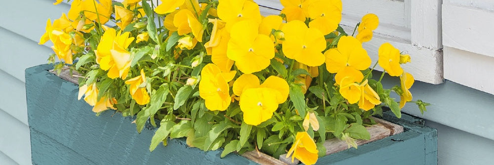
Behr shows how to incorporate this bright yellow in a flower planter, which looks beautiful against the planter painted in Behr's color: VOYAGE PPU13-07.

New England Fine Living's Instagram feed includes a classic New England-style home painted in a gray, much like Pantone's Ultimate Gray, and features window planters full of cheerful yellow daffodils. It makes us wonder if the homeowners were the inspiration for Pantone?
Benjamin Moore is known for being an interior designer's choice for paint colors (and certainly a Pinterest pin favorite). The company selected it's 2021 color of the year as Aegean Teal 2136-40, a warm blue-green color that is completely inviting. It's a bit spa-like yet with a richer hue that almost makes you think of fall. This is a beautiful color for a front door, or for the color-loving and bold homeowner, a gorgeous exterior color. We'd also love to see this color on big flower pots on a patio with beautiful flowers cascading over the edge.


Sherwin Williams, a behemoth in the paint industry, chose Urbane Bronze as its 2021 color of the year. This is a very deep, rich brown that has a bit of gray in it. The company says that is has a "nature-inspired energy" and that it helps calm and renew us. This is a much darker hue than the others, but the message is similar – colors that renew our souls after a challenging 2020. We love this color as an accent – on a gate, a raised flower bed or as inspiration for patio furniture. Home Bunch has a fantastic blog post where they share these ideas for using Urbane Bronze in your landscape décor.


Our takeaway from dreaming in color for a little bit is that everyone needs a punch of color in some way, shape, or form. Even if you love a white farmhouse, you can use some colorful flowers leading up to your home. Enjoy flowers on your patio also! Incorporate color in flowerpots, bright cushions on your patio furniture, or consider a bold front door color. There is a way to bring a little "sunshine" into your curb appeal, even if you don't choose Pantone’s Illuminating yellow choice.
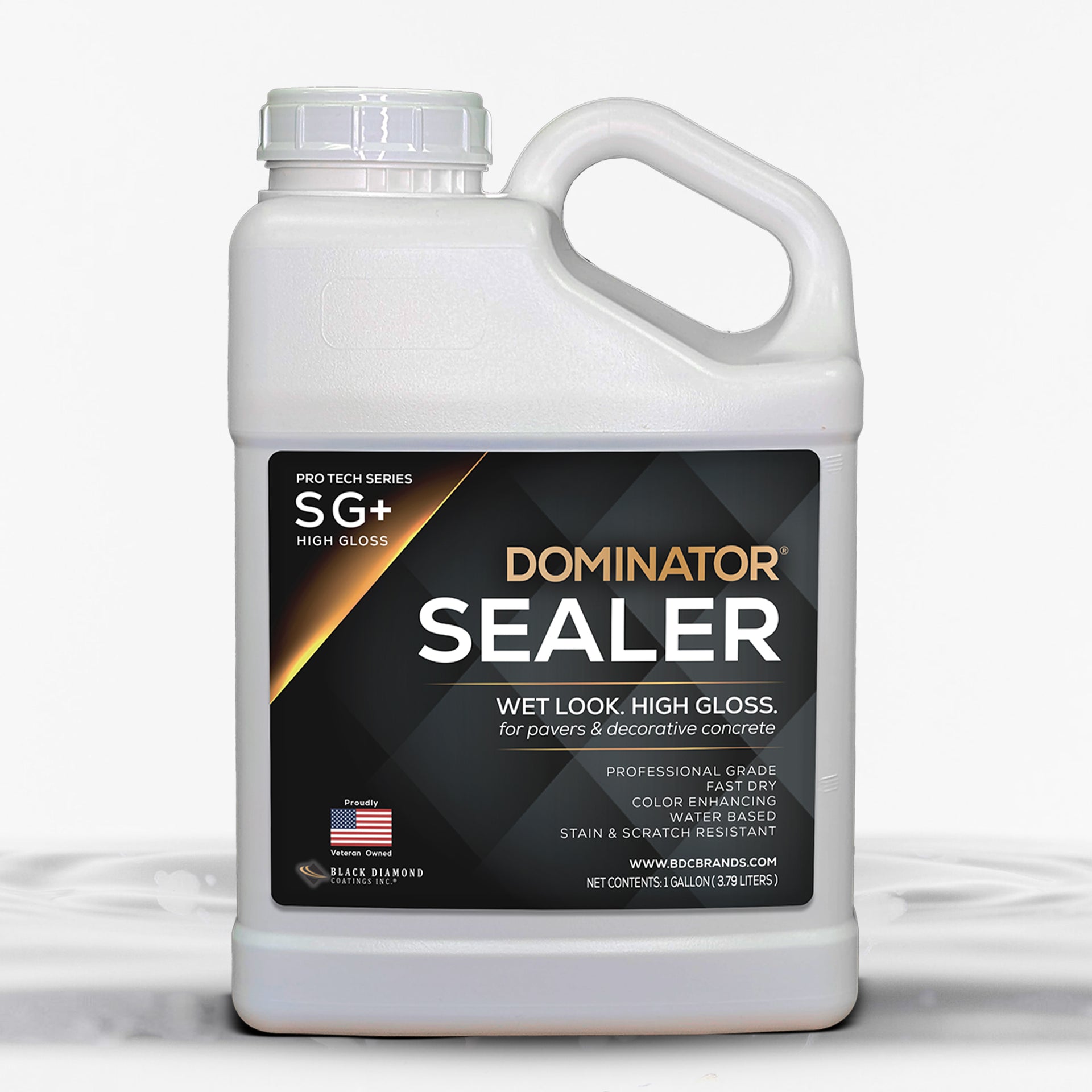
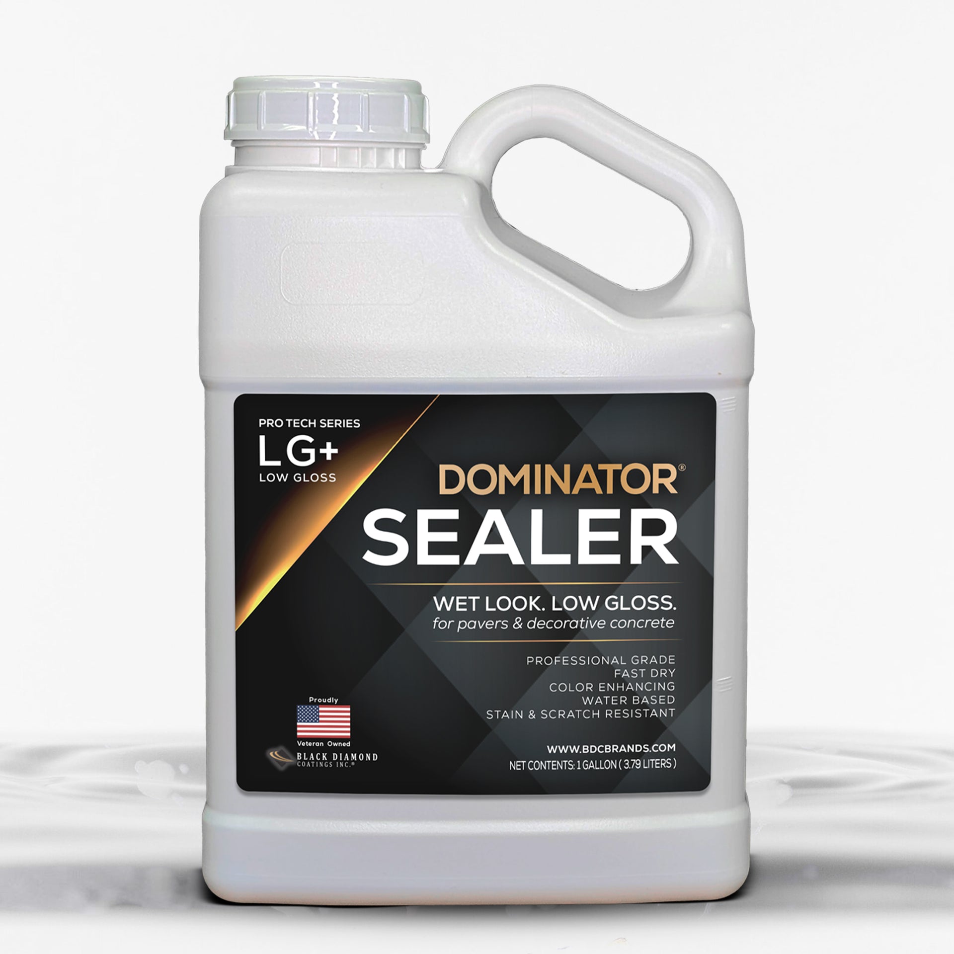
Finally, we would be remiss if we didn't mention that if color is what you crave, remember that you can give any hardscape a little boost of color with our DOMINATOR® sealers, which enhances the color and allows you to choose the level of shine that meets your preferences. We're here to inspire and help!
